
Challenge
The platform had the right data, but the experience made every answer feel one step too far away.
{Case Studies}
Not just screens. These are examples of how strategy, interface, content, and build decisions become one usable system.
Start yours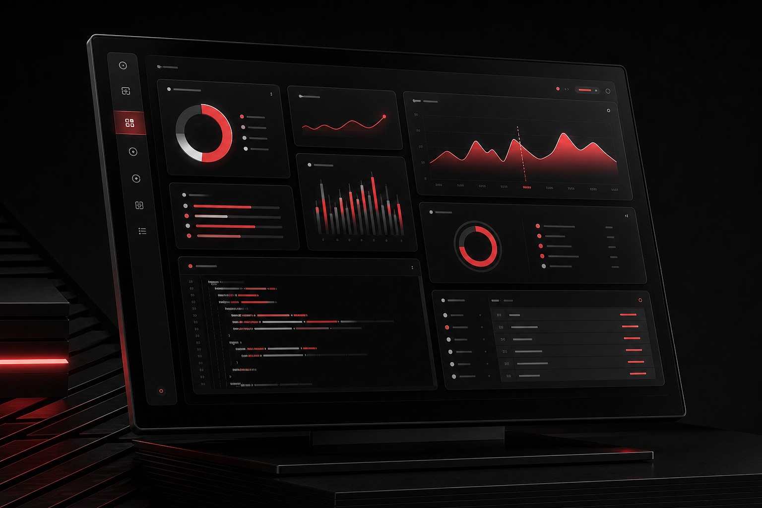
A data-heavy platform needed the confidence of an executive product and the utility of an operator tool.
The platform had the right data, but the experience made every answer feel one step too far away.
We rebuilt the hierarchy around scanning, comparison, drill-down, and reusable components that could scale with the product.
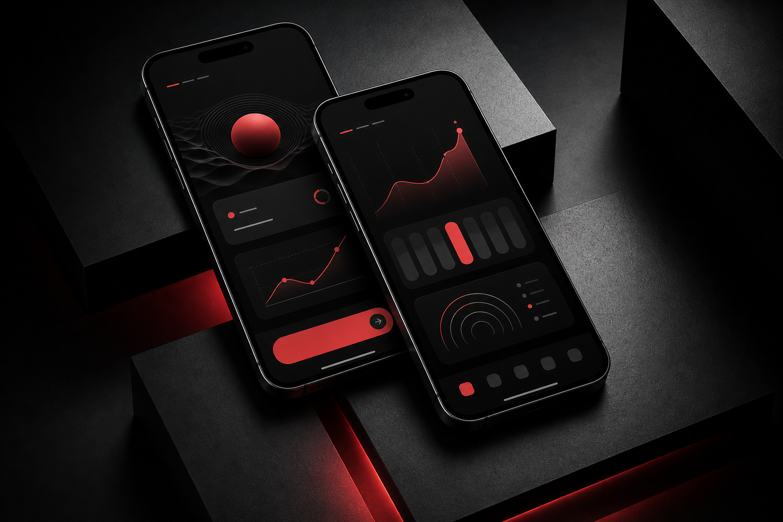
A mobile product needed to feel elevated without becoming precious. Fast, tactile, and easy to understand.
The product worked, but the experience did not yet have a visual or interaction language strong enough for launch.
We created a mobile system for onboarding, navigation, product cards, data moments, and high-contrast action states.
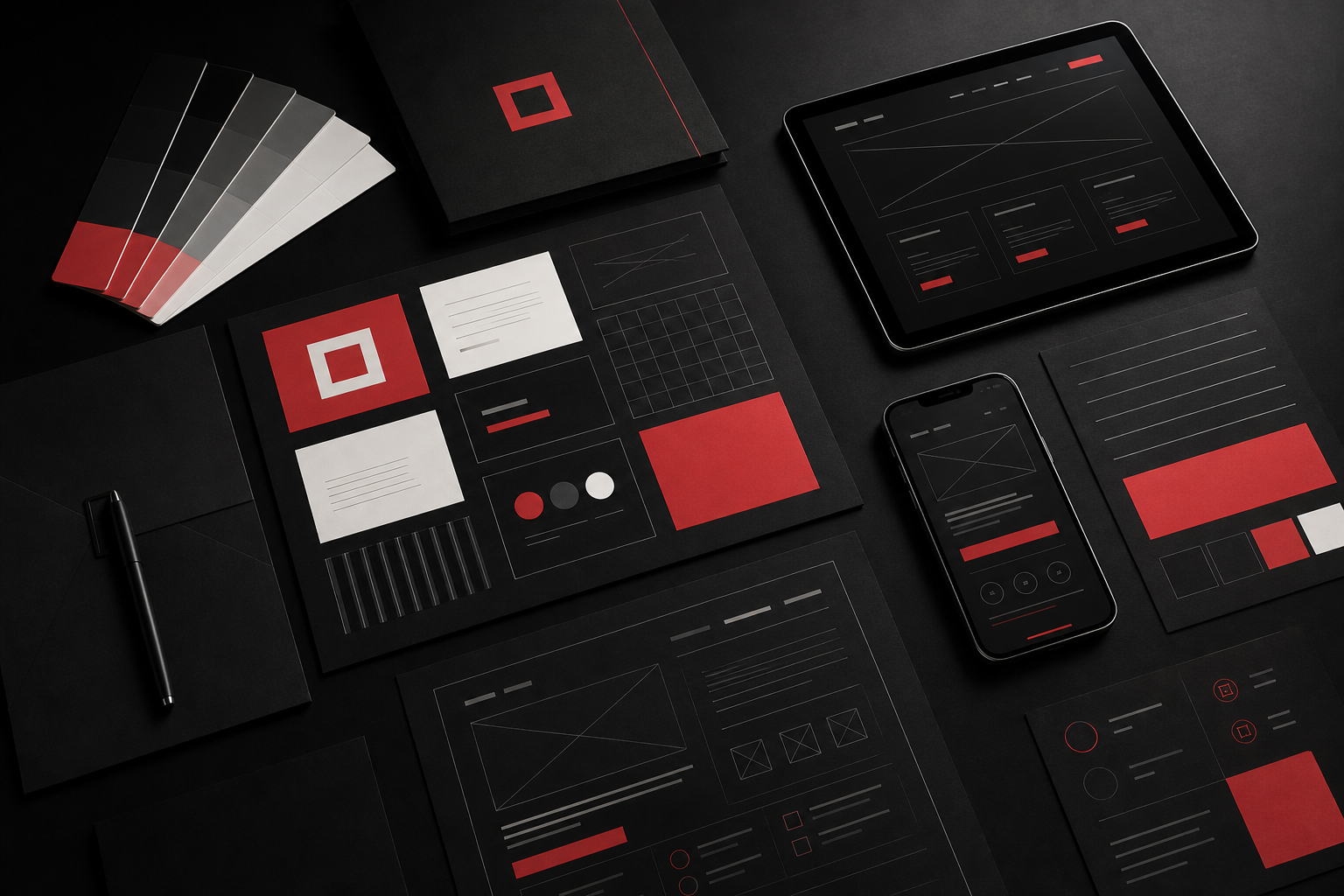
A scaling company needed to look as precise as its sales conversations sounded.
The company had momentum, but its brand and website still felt like an earlier stage of the business.
We shaped the positioning, identity language, page system, and modular components into a launch-ready brand platform.
{Next Project}